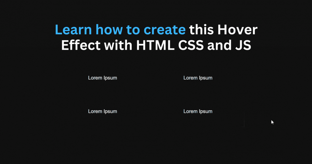
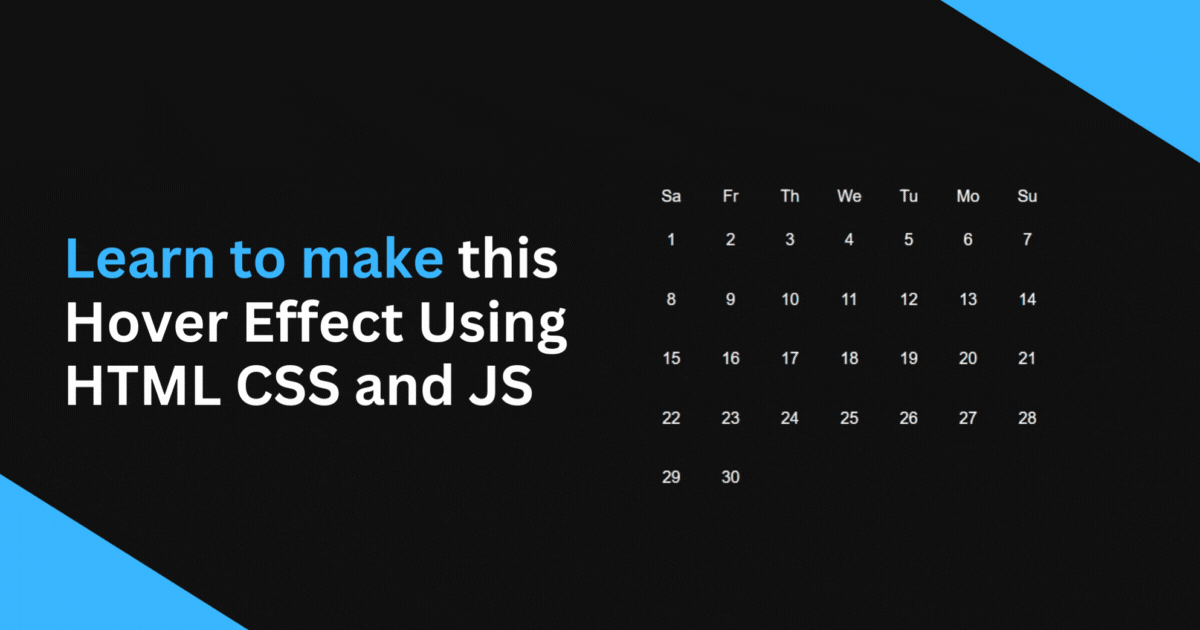
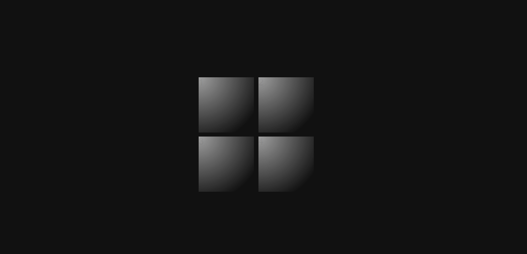
Windows 10 Calendar Hover Effect: A Step By Step Tutorial
Learn how to achieve this awesome windows 10 calendar like border hover effect that you can use in your website
I'm a frontend developer and i create web development content to help you out with your journey.
HTML Structure
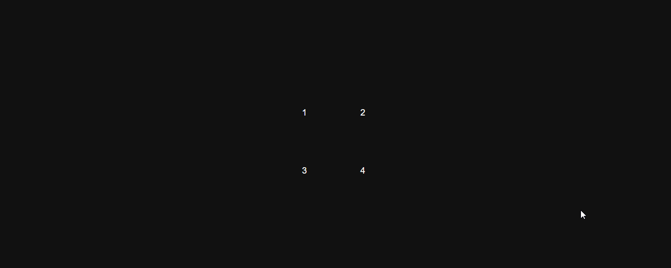
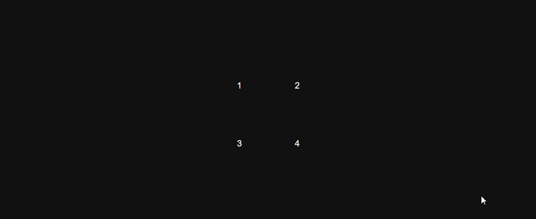
Let's start by creating the HTML structure, We will create four boxes only to keep this tutorial simple.
<div>
  <div class="container">
    <div class="box">
      <div class="box-content">1</div>
    </div>
    <div class="box">
      <div class="box-content">2</div>
    </div>
    <div class="box">
      <div class="box-content">3</div>
    </div>
    <div class="box">
      <div class="box-content">4</div>
    </div>
  </div>
</div>
CSS Styles
body {
  background-color: #111;
}

.container {
  gap: 8px;
  display: grid;
  grid-template-columns: repeat(2, 1fr);
  width: min(90%, 300px);
}

.box {
  position: relative;
  width: 100px;
  height: 100px;
}
Creating the Gradient Effect
Next, we will create a gradient effect on our boxes using the ::after pseudo-element by using the radial-gradient function to create a circle gradient inside of all the boxes.
.box::after {
  content: "";
  height: 100%;
  width: 100%;
  transition: opacity 500ms;
  background: radial-gradient(
    600px circle at 0 0,
    rgba(255, 255, 255, 0.6),
    transparent 20%
  );
  position: absolute;
}
Make the Gradient follow the mouse
For this one we will have to use JavaScript:
document.body.onmousemove = e => {
  for(const date of document.getElementsByClassName("box")) {
    const rect = date.getBoundingClientRect(),
          x = e.clientX - rect.left,
          y = e.clientY - rect.top;

    date.style.setProperty("--mouse-x", `${x}px`);
    date.style.setProperty("--mouse-y", `${y}px`);
  };
}
The code above loops through all the boxes whenever the mouse moves and takes the position of the mouse. It then sets two CSS custom variables (--mouse-x and --mouse-y), which we can use to position the gradient inside the boxes.
We can now use the (--mouse-x and --mouse-y) custom variables in our CSS to position the gradient based on the mouse position:
.box::after {
  background: radial-gradient(
    600px circle at var(--mouse-x) var(--mouse-y),
    rgba(255, 255, 255, 0.6),
    transparent 20%
  );
}
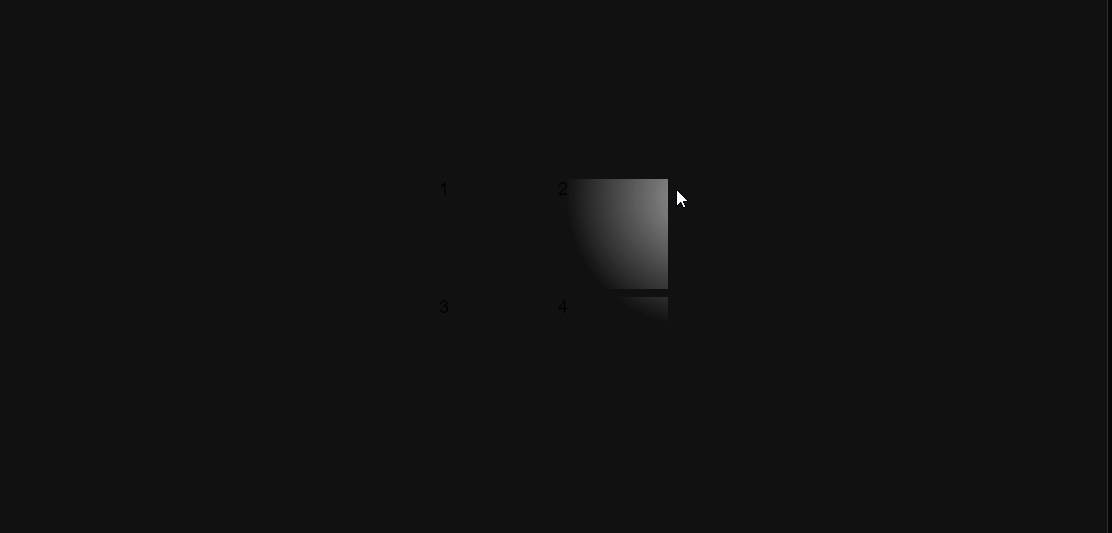
Covering the Gradient up
At this point, the gradient glow effect is working but you can see the whole gradient when moving the cursor and we only need it to be visible a few pixels on all sides to create the border effect.
We can fix this by using the box-content div to cover it up:
.box::after {
 z-index: 1;
}

.box-content {
  background-color: #111;
  position: absolute;
  z-index: 2;
  color: white;
  display: flex;
  align-items: center;
  justify-content: center;
}
We set the background-color of the box content to match the background color of the page and set the z-index higher than the ::after pseudo element (gradient) which puts it below the box-content.
Now we have to set the inset property to 3px which makes the gradient only visible 3px on all sides of the box-content which creates a border-like effect.
.box-content {
  inset: 3px;
}
Making the border lighter on hover
Finally, let's add a simple hover effect in the div with box class to make the border lighter when we hover over the boxes.
.box:hover{
  background-color: rgba(255, 255, 255, 0.4);
}
Here's the codepen link
That's it you just learned how to achieve this awesome hover effect, I hope you found this one helpful and If you have any questions or comments please feel free to leave them below.