Learn how to create this awesome border hover effect
In this blog you'll be able to learn how to achieve this awesome gradient border effect that circles in an element on hover
Updated
•2 min read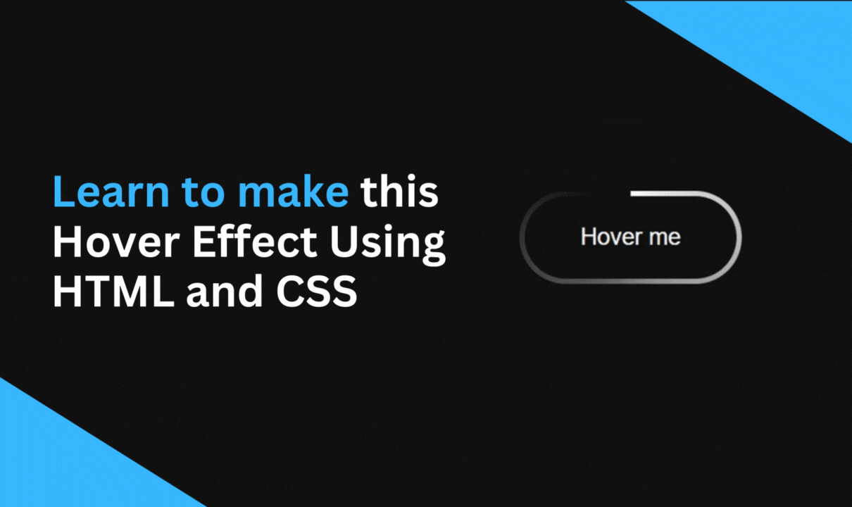
A
I'm a frontend developer and i create web development content to help you out with your journey.
HTML Setup
<button class="btn">
    Hover me
</button>
CSS Styles
body {
  background: #111;
}

.btn {
  cursor: pointer;
  background: none;
  border: none;
  color: white;
  border-radius: 100vmax;
  padding: 1rem 2rem;
  position: relative;
}
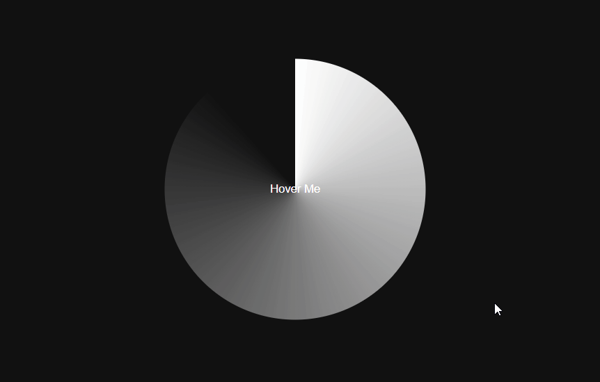
The Gradient Effect
.btn::before {
  content: "";
  background-image:
    conic-gradient(
      #fff 0deg, transparent 320deg
    );

  /* Should be bigger than button */
  height: 200px;
  width: 200px;


  /* Centering the gradient  */
  position: absolute;
  top: 50%;
  left: 50%;
  transform:
      translate(-50%,-50%)
      rotate(0deg);

  border-radius: inherit;
  transition:
        transform 1s
        cubic-bezier(0.3, 1, 0.3, 1);
}
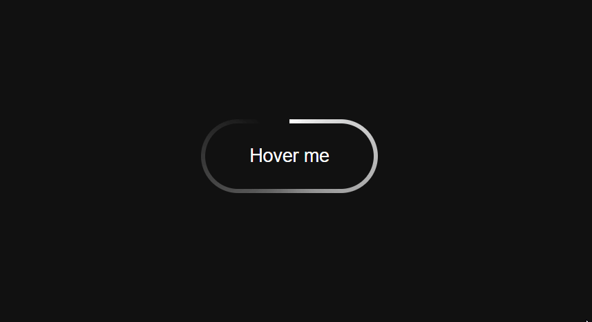
Rotate Gradient on Hover
.btn:hover::before {
  transform:
        translate(-50%,-50%)
        rotate(-360deg);
}
Set overflow hidden in the parent element
.btn {
  overflow: hidden;
}
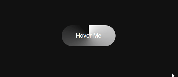
Covering up the gradient
- Here we added btn-content div to cover up the gradient by setting its background color same as the main body color of the page and setting the gradient z-index to -1
<button class="btn">
  <div class="btn-content">
       Hover me
  </div>
</button>
.btn {
  /* Becomes Border Size */
  padding: 3px;
}

.btn::before {
  /* Put gradient behind btn-content */
  z-index: -1;
}

.btn-content {
  background: #111;
  padding: 1rem 2rem;
  border-radius: inherit;
}
Here's the Codepen Link
That's it you just learned how to create this awesome hover effect, I hope you found this one helpful and If you have any questions or comments please feel free to leave them below.